


On Intuitivity
Sunday, 2005-09-11; 12:57:00
Before I get to today's pet bug, I'd like to go on a long diversion to that wondrous land where Mac users get lost, only to emerge as usability nazis. I went there today.
What is intutivity?
Good usability, or, "intuitivity", you might say. Ah, that wondrous neverland concept to which all operating systems and applications aspire, but which many fail to achieve. How does one define good usability?
It's funny. One of the things that most Mac users say about their choice operating system is that it's "intuitive" and "easy-to-use", even while retaining a bunch of powerful features. Doing something is more "straightforward" -- it's "natural". I might have even been known to say such things. But with computers, these terms aren't that well-defined: what does "staightforward" mean in terms of usability?
Let's take a specific example. Drag-and-drop. On the Mac, many applications (and almost all of Apple's own applications) try to employ some kind of drag-and-drop functionality in order to allow you to perform certain functions. For example, Mac OS X Mail (I don't like the term "Apple Mail") allows you to drag-and-drop any file from the Finder into a message window to attach the file to the e-mail. Or take, for example, iPhoto -- it allows you to drop files from the Finder into the photo library, and then iPhoto will proceed to scan and import the dropped files. Even the Terminal has drag-and-drop functionality -- when you drag and drop a file or folder onto a Terminal window, the Terminal automatically types the complete path to that file, so you can type "cd ", drag the folder, type return, and you'll be in that folder without having had to have typed the ridiculously long path manually.
To a Mac user, he would define this drag-and-drop functionality as "intuitive". He wants to take this one thing that sits here, and put it over there, so a Mac user naturally tries to simply drag it and drop it. But is this "intuitive"? If you plopped a Windows user down at a Mac and asked him to do any of the above things, he would probably go searching for a menu for importing or attaching, or perhaps trying to "copy" the file and "paste" it into the Terminal. Is that any less intuitive than drag-and-drop?
Point is, "intuitivity", at least on computers, is oftentimes simply what the user is used to. A Mac user is used to drag-and-drop, since it was ingrained into his head way back in the Classic Mac OS. But a Windows users hasn't necessarily had the time to develop this kind of thinking, and so drag-and-drop may not be "intuitive" to him.
So is there a way to define "intuitivity"? (OK, I'll stop using the quotes now.) Perhaps we can define it as the closest analog to our physical world. That is, if we had a piece of paper that we wanted to send to someone by snail mail, a person would go pick up the piece of paper, fold it, and put it in the envelope. Drag-and-drop is similar: if you have something here and want it there, just pick it up and put it where you want it! Of course, actions like folding in the physical world are unnecessary in the virtual world -- there's no need to force someone to fold a document file before putting it in an e-mail; unless you want to somehow construe compression as a sort of virtual folding.
But if we take that definition of intuitivity, every operating system, including Mac OS X, falls flat on its face. Bear with me for a minute: imagine, if you will, your physical home modeled after the Mac OS. If you wanted to group a couple of papers together in a manilla folder, you'd jump up to this great big menu at the top of your house (low gravity?), climb down, punch the "New Folder" sign, and fall back down to the floor where a new manilla folder just materialized.
OK, I kid. But the concepts of the virtual world are often so foreign and have no analogs in the physical world (what is the Dock's physical analog -- a twister board that does chores?), that the former definition of intuitivity can't possibly be a rigid one. Perhaps this applies only in the case when you have similar actions in the virtual and physical world: in these cases, intuitivity means replicating the physical action.
How about in the other cases? Maybe a good definition is making every action as fast as possible. In some cases, that would mean using the keyboard (like when you're looking at a window in the Finder and you want to quickly find a file -- just start typing it's name and voilà, it will be selected). Other cases would involve the mouse, as in the former drag-and-drop scenarios.
Oh man, but "cat file.txt | grep -i Finder > ~/Desktop/found.txt" is so much faster at finding lines that contain the word "Finder" than using a find panel in TextEdit is. So intuitivity defined in such a way means that our friendly UNIX consoles would be the most intuitive in many cases. Surely that can't be the case.
Other possible definitions include consistency or possibly (and more specifically) adherence to Fitt's Law, but I'm being esoteric here and rambling. I'm sure you want me to get to the point.
It's the little things
It's always the quiet ones: that sneaky little dot in the close box that lets you know you have unsaved changes in the current document, or the little red underlines that appear under misspelled words that appear almost everywhere you can type text, or even services, probably one of the most-underused feature in Mac OS X, that allow you to perform specific actions on specific objects no matter what application you're using. These three little features in Mac OS X are perfect examples of usability: they're consistent, they allow you to do something fast, and while they might not have an analog to the physical world, at least they're easy to learn and understand (another possible definition of usability, but one that is also very vague).
These three little features are also at the crux of an often heated debate concerning usability, and more specifically the usability of two different application frameworks in Mac OS X: Carbon and Cocoa. The "dirty" dot, the red underlines and services are three things that are provided "for free" with Cocoa applications, but not with Carbon ones. What this means is that Mac developers who write programs in Cocoa will automatically be able to use services in their applications, and any documents will automatically take advantage of the dirty dot, and text fields will be able to use the system-wide spell checking, usually without adding a single line of code. With Carbon, it requires a lot more work.
These three damned little features make it easy for anyone with a little bit of knowledge about Mac OS X to spot Cocoa and Carbon apps quite easily. If one or more of these three features is present in an application, it's likely Cocoa. Not because Carbon can't do it, but because it requires more time for Carbon programmers to implement features like this, and so they're less inclined to take the effort. The customizable toolbar -- the one where you use a customization palette to add or remove buttons and you can command-drag to rearrange buttons without opening the palette -- is a DEAD giveaway for a Cocoa application (save of course the Finder, but we'll get to that later). Cocoa developers have it easy when creating toolbars, since the Cocoa application programming interfaces (APIs) already define many of the functions necessary to use these cool customizable thingamabobs.
I quote thusly:
This comes from one of my favorite Mac pundits, John Gruber over at Daring Fireball, who often writes and rants on usability in the Finder. Ranting, in the good sense, like my ranting. (If Gruber ever reads this, I apologize for using the word "pundit" when referring to you.)
Gruber, in this quote, was flogging Andrew Stone of Stone Design for saying that Carbon applications are not "native" Mac OS X applications and that he would absolutely not support Carbon applications in his FontSight utility, despite being asked by hundreds of Mac users for such a utility that DID support Carbon applications. They wanted something that was useful in all of their applications, not just a subset.
How does this all relate back to intuitivity? Well, because of features like the triumvirate previously mentioned. These aren't the only ones that Cocoa gets for free (or relatively easily), and because of all the cool things that Cocoa has to offer, Mac users have started to feel that Cocoa IS the feature, not the triumvirate. There are many small features that virtually all Cocoa applications have that make them easier to use; they often provide little reminders of things that stay out of your way (unlike those annoying little speech bubbles that pop up in Windows XP from the system tray and obscure like half of your screen). They're NICE! And since many Carbon developers don't implement such features because it takes more time, Mac users think that Carbon is the problem. Like the aforementioned Andrew Stone.
Whiz-bang text fields and aggravating metawindows
Let's take a look at a specific feature that's intuitive. Watch this movie (QuickTime 6 required). Do you see what I'm talking about?
When you move your cursor from one line to the next in a one-line text field, the text field smoothly scrolls DIAGONALLY to your new cursor position. I can't recall ever seeing this feature before, so it might be Tiger-only -- but it's such an obscure feature, at least in this case, that you might never encounter it. (By the way, "smooth scrolling" has to be turned on in the Appearance preference pane.)
This is the hallmark of intuitivity. If you have smooth scrolling turned off, the text field will just jump to the new cursor position without the smooth transition. This gives you no context about where you are. But the smooth scrolling establishes context on your new cursor position relative to your old one -- it's down one line and to the right. It's easy to see in the brief split-second transition. You probably wouldn't see this feature in a larger text area, because those usually have soft wrapping, which forces all lines to wrap when being displayed, and so you'd only see a smooth vertical transition, not a diagonal one.
You might think that I'm praising such an insignificant little feature that hardly anyone would ever use, but it illustrates what intuitivity is. The feature is subtle, stays out of your way, establishes context, is fast enough to not make you wait, and is pleasing to the eye. Now we're starting to get a more concrete definition of intuitivity.
Now take a look at this screenshot from the Windows version of Hotline client (source):
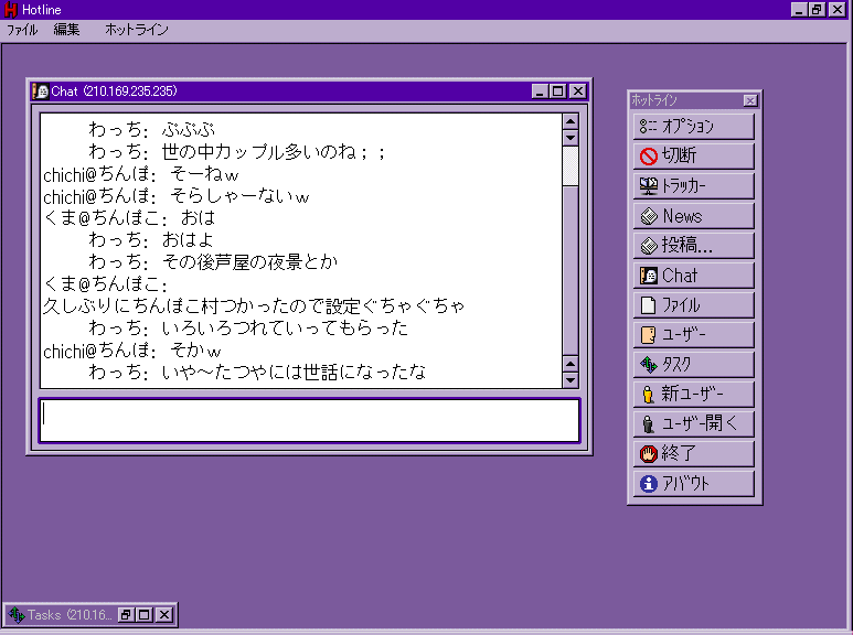
This illustrates the single most evil creation ever to occur on the face of any operating system. That window-that-encloses-other-windows. I coin the term "metawindow" for this monstrosity.
Metawindows on Windows never fail to piss me off. They limit where you can position windows of that one app for the sake of allowing you to minimize all of the windows at once simply be minimizing the metawindow. But this "feature" makes it so horrible to manage these windows -- you have to make sure you have the metawindow to the size and location that you want before being able to position the inner windows.
This problem stems from the fact that Windows is document-centric: it places the focus on documents not applications. There's no real concept of an application on Windows -- suppose you double-click on the Internet Explorer icon twice. In Windows, this creates two browser windows, while on the Mac, the first double-click creates one browser window, and the second double-click brings you back to the web browser and the existing document window. The Mac is application-centric, meaning that the main focus is around applications (and why double-clicking the same app twice is redundant), while Windows is document-centric -- double-clicking the same application twice in Windows signifies that you must want two separate documents open.
These metawindows are evil creations that exist for the sake of making up for a different usability problem: that of getting all the windows from one "application" out of the way; in this case, if you want to get all of Hotline's windows out of the way, you'd just minimize the metawindow -- if that weren't there, you'd have to minimize two windows and click a close box (at least according to the screenshot; Hotline has many more windows if I recall). On the Mac, you simply hide the application, since the concept of an application is a concrete one.
But the Mac way of doing things has a different fault. What do you do when the last window of an application is closed? Does the application quit? On the Classic Mac OS, the answer was a definite no. On Mac OS X, it depends. Applications like System Preferences or iPhoto automatically quit when you close the last window. Other applications stay open even when there are no windows open. This drives Windows users batty.
As a Mac user, I rationalize it by saying that closing a window does not mean I want to close the application. To take a physical analog: if I finish a homework assignment in my notebook, that does not mean I will not immediately start another in the same notebook. If I closed the notebook and put it on the shelf every time I finished my assignment only to get it back from the shelf and immediately open it again to start another assignment, I've wasted precious seconds and I look silly to anyone around. As a Mac OS X user, I rationalize the inconsistency by saying that when dealing with applications that have only one window (like iPhoto and System Preferences), of course I don't want to use it anymore after I close that window -- there's only one of them, so closing the window should be tantamount to closing the application.
But this application concept isn't necessarily intuitive; it's just natural to a Mac user because we're used to it after years of using the Mac OS. Metawindows are evil and unintuitive to me as a Mac user, but to a Windows user it might be an acceptable trade-off of usability. I deem it evil, but are these evil to Windows users?
Railing on Themes
Here's another example.


"Which one of these is not like the other? Which one of these just doesn't belong?" (No, in case you were wondering, I only watched Sesame Street once or twice as a kid -- we didn't have TV, so I only would have had the chance to see it at my gramma's house.) And no, it has nothing to do with the dirty dot.
But the answer is the third from left. Why? Of these four different window themes, this is the only one that can NOT be dragged by the empty space in the toolbar -- it must be dragged by using the title bar. Now quick, identify which is Brushed Metal, which is Aqua, which is Unified Toolbar, and which is iTunes 5. And to add to the mix, tell me where these two came from:


The left is from GarageBand, and the right is from DVD Studio Pro. GarageBand's theme is unique to that application, while DVD Studio Pro's theme is pretty much standard across all of Apple's pro apps (Logic Pro, Final Cut Pro, DVD Studio Pro, Motion, etc.). GarageBand's window is a bit of an outlier -- the bottom half of the window is draggable, but only certain parts. In the screenshot below, you can only drag the window by the portion of the dark brushed metal that's below the controls, not next to or above the controls. Weird.

As for DVD Studio Pro, someone needs to enlighten me, because I don't have that app. I just filched the screenshot from the net (source).
On iTunes 5
Everyone on the net has been railing about iTunes 5 and it's new UI with the much squarer window and the smooth metal look (a.k.a dark Unified Toolbar), with the funniest going to none other than Gruber. Everyone has been focusing on the APPEARANCE of the various themes in Mac OS X, but I think everyone's been skirting the main point: none of them has been focusing on usability.
By any measure, iTunes 5's new interface is certainly more usable. There are no more margins, which means more room for your music database, and iTunes' new minimized mode has a larger "LCD" which displays more info. Take a look:


Compared to iTunes 4, here are the specific enhancements afforded by iTunes 5:
1. The song name is ALWAYS displayed in the top line. In iTunes 4, the top line rotated between the song name, artist name, and album name. Now you never have to click to see what song you're playing (and even then you wouldn't necessarily know, because it's not clear whether you're looking at the song, artist, or album name in iTunes 4).
2. You will now always see the time elapsed, and you have the choice of displaying the remaining time or the total time. (Click on the time remaining/total time in iTunes 5 to toggle between the two.) In iTunes 4, you could only see one of remaining time, elapsed time, and total time.
3. There's now a progress bar in the minimized window. You can now immediately jump to a specific point in the song without having to rely on the imprecise click-and-hold on the previous/next track buttons. In iTunes 4, you needed to unminimize to do this.
So iTunes 5 has better usability over iTunes 4, and therefore is more intuitive.
But let's touch on what everyone else HAS been talking about: iTunes 5's introduction of yet another interface theme: dark Unified Toolbar. But does it really matter if Mac OS X has 6 different interface themes? I don't think so. The first four -- Brushed Metal, Unified Toolbar, Aqua, and dark Unified Toolbar -- all just have subtly different shades of gray and subtly different textures. None of them particularly stand in contrast to the others; I think they all look quite pleasant. The last two -- GarageBand's egregious use of a seemingly Halloween/wooden theme, and Apple's Pro theme -- are quite contained.
Personally, though, while others think that the six different themes detract from Mac OS X's intuitivity, I've come to the conclusion that that's not necessarily the case. When looking at my screen, the subtle differences in the themes are precisely what allow me to pinpoint which window goes to which application. By just glancing, I know that the window minimized at the top of the screen is iTunes 5 not only because of its location but also because of its color and texture. Similarly, I can quickly pinpoint Safari's windows and iChat's windows because they're brushed metal. Mail's Unified Toolbar look stands out against these, allowing me to pinpoint that window as well. Even GarageBand's egregious look and Apple's pro theme allow me to quickly pinpoint to which application a certain window belongs.
(Personally, I've come to enjoy Apple's tinkering with the user interface. Certain looks just become stale after time, and subtle differences, like the one introduced with iTunes 5, spruce things up a bit. As long as Apple doesn't add green windows as a standard theme and keeps to just subtle changes, I'm all for it.)
There's another aspect to the usability of the different themes, and it relates to the quiz before. Remember, out of the four themes (excluding GarageBand's theme and the Pro app theme), only Aqua cannot be dragged by the empty space in the toolbar. It looks to me like Apple is trying to phase Aqua out in favor of Unified Toolbar. This, again, is a usability plus, and makes using Mac OS X more intuitive. By eventually eliminating the Aqua theme, Apple will have made all windows draggable by empty space. This makes things consistent and reliable.
Multi-button Mice
Another thing that drives Windows users batty when switching to the Mac is the lack of a second mouse button. To them, a second mouse button is a necessity. One of the reasons is because Windows software oftentimes hides options and features inside contextual menus, and ONLY inside these contextual menus, meaning you have to use them to use those features. That means constantly using the right-click.
On the Mac, Apple has always shipped one button mice standard, so application developers cannot rely on the fact that every Mac will come with a multi-button mouse. Since many novice users don't know about control-clicking, they're forced to keep options in normal places (like normal menus) and results in higher usability. I offer my previous analysis.
Are multi-button mice more intuitive than control-clicking, though?
I would argue that it is not. I offer myself as evidence. I've been a Mac user since my dad got a Mac Plus back in.. 1986, I think. I've never bought a multi-button mouse. (There was the time that I won a Microsoft IntelliMouse at MacWorld, but it was horrendously huge and I finally ditched it for Apple's optical Pro Mouse.) Yet I would say that I'm probably more of a power user than many of my friends who swear by multi-button mice.
The reason is that I try to keep both hands on the keyboard at all times. Here's an example I've given before on a Mac forum: when I'm using one of the Macs at school to get my mail, I usually use Safari to open webmail at both my .mac account and my Stanford account. How do I do it? First, launch Safari (usually by clicking in the Dock since that's the fastest). Then... all together now...
Command-L, webmail.mac.com, return, Command-T, Command-L, webmail.stanford.edu, Command-Shift-Left Arrow, username, tab, password, enter, Command-Shift-Right Arrow, username, tab, password, enter, option-tab (to select the link that confirms my login), enter, and finally enter (to click another button to actually enter the webmail web app). Only THEN do I pick up my mouse, since option-tabbing through links to hundreds of e-mails will get me nowhere fast.
Since I usually have both hands on the keyboard, it's natural for me to control-click with my left pinky finger. While my right hand reaches for the mouse, my pinky finger moves to the control-key, and I can execute a "right-click" in no time. My left hand is virtually ALWAYS on the keyboard, meaning a control-click is fast and easy. So to me, multi-button mice are worthless! They don't help me do anything faster, because I can already do a "right-click" with a one-button mouse just as fast. (Scroll wheels/balls are a different matter.)
So you see, what's natural and intuitive to someone, isn't necessarily natural or intuitive to someone else.
Wherein I stop rambling and get to the point
So in the end, intuitivity is all in the eye of the user. But there are some things that hint at intuitivity:
1. Does the interface allow you to do what you want quickly?
2. Does the interface stay out of your way?
3. Does the interface present meaningful and useful options to customize the interface, and not overwhelm you?
4. Is the interface consistent?
5. Does the interface use knowledge from the physical world to help you organize things in the virtual world?
And in the end, it's the features that create that intuitivity. A dirty dot in a Cocoa application enhances the usability of that application, whereas the lack of it in a Carbon application makes all of Mac OS X less consistent and gives you less information in that application. Moral: let developers know specific features that you want added, not the programming language in which you want the program written. (And for god's sake, PLEASE stop telling Apple to rewrite the Finder in Cocoa -- bad design decisions will create bad usability, whether written in Carbon or Cocoa.)
RAB Friday IV: Spotlight Menu's Field
I'll end with my pet bug for this week. (What? It's still Friday!) I decided to forego my cosmetic bug and instead try to present something relevant to this whole rant about intuitivity.
If you have Tiger, click on the Spotlight menu or bring it up using your shortcut. Type something long that makes Spotlight search for a while... you should still have only your Spotlight text field up and nothing else showing in the menu. Since your cursor is presumably at the end of the text field, press the up arrow. Notice that your cursor doesn't move to the start of the text field as expected.
I realize that the up and down arrow keys have been hijacked for menu use. But when there's NOTHING in the menu, they should work as they normally do in text fields -- they should go to the beginning or the end of the text field. This is a choice example of the interface not being consistent and so it messes up users like me who like to use the keyboard as much as possible. (And one should also note that this is also the result from the union of a text field and a menu. There's inevitably going to be some functionality conflict from a combo like that.) Bug filed.
(And finally, just for reference, last week's bug has been marked as a duplicate.)
What is intutivity?
Good usability, or, "intuitivity", you might say. Ah, that wondrous neverland concept to which all operating systems and applications aspire, but which many fail to achieve. How does one define good usability?
It's funny. One of the things that most Mac users say about their choice operating system is that it's "intuitive" and "easy-to-use", even while retaining a bunch of powerful features. Doing something is more "straightforward" -- it's "natural". I might have even been known to say such things. But with computers, these terms aren't that well-defined: what does "staightforward" mean in terms of usability?
Let's take a specific example. Drag-and-drop. On the Mac, many applications (and almost all of Apple's own applications) try to employ some kind of drag-and-drop functionality in order to allow you to perform certain functions. For example, Mac OS X Mail (I don't like the term "Apple Mail") allows you to drag-and-drop any file from the Finder into a message window to attach the file to the e-mail. Or take, for example, iPhoto -- it allows you to drop files from the Finder into the photo library, and then iPhoto will proceed to scan and import the dropped files. Even the Terminal has drag-and-drop functionality -- when you drag and drop a file or folder onto a Terminal window, the Terminal automatically types the complete path to that file, so you can type "cd ", drag the folder, type return, and you'll be in that folder without having had to have typed the ridiculously long path manually.
To a Mac user, he would define this drag-and-drop functionality as "intuitive". He wants to take this one thing that sits here, and put it over there, so a Mac user naturally tries to simply drag it and drop it. But is this "intuitive"? If you plopped a Windows user down at a Mac and asked him to do any of the above things, he would probably go searching for a menu for importing or attaching, or perhaps trying to "copy" the file and "paste" it into the Terminal. Is that any less intuitive than drag-and-drop?
Point is, "intuitivity", at least on computers, is oftentimes simply what the user is used to. A Mac user is used to drag-and-drop, since it was ingrained into his head way back in the Classic Mac OS. But a Windows users hasn't necessarily had the time to develop this kind of thinking, and so drag-and-drop may not be "intuitive" to him.
So is there a way to define "intuitivity"? (OK, I'll stop using the quotes now.) Perhaps we can define it as the closest analog to our physical world. That is, if we had a piece of paper that we wanted to send to someone by snail mail, a person would go pick up the piece of paper, fold it, and put it in the envelope. Drag-and-drop is similar: if you have something here and want it there, just pick it up and put it where you want it! Of course, actions like folding in the physical world are unnecessary in the virtual world -- there's no need to force someone to fold a document file before putting it in an e-mail; unless you want to somehow construe compression as a sort of virtual folding.
But if we take that definition of intuitivity, every operating system, including Mac OS X, falls flat on its face. Bear with me for a minute: imagine, if you will, your physical home modeled after the Mac OS. If you wanted to group a couple of papers together in a manilla folder, you'd jump up to this great big menu at the top of your house (low gravity?), climb down, punch the "New Folder" sign, and fall back down to the floor where a new manilla folder just materialized.
OK, I kid. But the concepts of the virtual world are often so foreign and have no analogs in the physical world (what is the Dock's physical analog -- a twister board that does chores?), that the former definition of intuitivity can't possibly be a rigid one. Perhaps this applies only in the case when you have similar actions in the virtual and physical world: in these cases, intuitivity means replicating the physical action.
How about in the other cases? Maybe a good definition is making every action as fast as possible. In some cases, that would mean using the keyboard (like when you're looking at a window in the Finder and you want to quickly find a file -- just start typing it's name and voilà, it will be selected). Other cases would involve the mouse, as in the former drag-and-drop scenarios.
Oh man, but "cat file.txt | grep -i Finder > ~/Desktop/found.txt" is so much faster at finding lines that contain the word "Finder" than using a find panel in TextEdit is. So intuitivity defined in such a way means that our friendly UNIX consoles would be the most intuitive in many cases. Surely that can't be the case.
Other possible definitions include consistency or possibly (and more specifically) adherence to Fitt's Law, but I'm being esoteric here and rambling. I'm sure you want me to get to the point.
It's the little things
It's always the quiet ones: that sneaky little dot in the close box that lets you know you have unsaved changes in the current document, or the little red underlines that appear under misspelled words that appear almost everywhere you can type text, or even services, probably one of the most-underused feature in Mac OS X, that allow you to perform specific actions on specific objects no matter what application you're using. These three little features in Mac OS X are perfect examples of usability: they're consistent, they allow you to do something fast, and while they might not have an analog to the physical world, at least they're easy to learn and understand (another possible definition of usability, but one that is also very vague).
These three little features are also at the crux of an often heated debate concerning usability, and more specifically the usability of two different application frameworks in Mac OS X: Carbon and Cocoa. The "dirty" dot, the red underlines and services are three things that are provided "for free" with Cocoa applications, but not with Carbon ones. What this means is that Mac developers who write programs in Cocoa will automatically be able to use services in their applications, and any documents will automatically take advantage of the dirty dot, and text fields will be able to use the system-wide spell checking, usually without adding a single line of code. With Carbon, it requires a lot more work.
These three damned little features make it easy for anyone with a little bit of knowledge about Mac OS X to spot Cocoa and Carbon apps quite easily. If one or more of these three features is present in an application, it's likely Cocoa. Not because Carbon can't do it, but because it requires more time for Carbon programmers to implement features like this, and so they're less inclined to take the effort. The customizable toolbar -- the one where you use a customization palette to add or remove buttons and you can command-drag to rearrange buttons without opening the palette -- is a DEAD giveaway for a Cocoa application (save of course the Finder, but we'll get to that later). Cocoa developers have it easy when creating toolbars, since the Cocoa application programming interfaces (APIs) already define many of the functions necessary to use these cool customizable thingamabobs.
I quote thusly:
Carbon and Cocoa are developer APIs; they are of no interest whatsoever to normal Mac users. None. Really. Normal Mac users choose their software based on tangible surface qualities — the features, the human interface, their existing toolset, etc. They don’t care what programming tools were used to create their software any more than they care what CAD program was used to design their automobiles.
This comes from one of my favorite Mac pundits, John Gruber over at Daring Fireball, who often writes and rants on usability in the Finder. Ranting, in the good sense, like my ranting. (If Gruber ever reads this, I apologize for using the word "pundit" when referring to you.)
Gruber, in this quote, was flogging Andrew Stone of Stone Design for saying that Carbon applications are not "native" Mac OS X applications and that he would absolutely not support Carbon applications in his FontSight utility, despite being asked by hundreds of Mac users for such a utility that DID support Carbon applications. They wanted something that was useful in all of their applications, not just a subset.
How does this all relate back to intuitivity? Well, because of features like the triumvirate previously mentioned. These aren't the only ones that Cocoa gets for free (or relatively easily), and because of all the cool things that Cocoa has to offer, Mac users have started to feel that Cocoa IS the feature, not the triumvirate. There are many small features that virtually all Cocoa applications have that make them easier to use; they often provide little reminders of things that stay out of your way (unlike those annoying little speech bubbles that pop up in Windows XP from the system tray and obscure like half of your screen). They're NICE! And since many Carbon developers don't implement such features because it takes more time, Mac users think that Carbon is the problem. Like the aforementioned Andrew Stone.
Whiz-bang text fields and aggravating metawindows
Let's take a look at a specific feature that's intuitive. Watch this movie (QuickTime 6 required). Do you see what I'm talking about?
When you move your cursor from one line to the next in a one-line text field, the text field smoothly scrolls DIAGONALLY to your new cursor position. I can't recall ever seeing this feature before, so it might be Tiger-only -- but it's such an obscure feature, at least in this case, that you might never encounter it. (By the way, "smooth scrolling" has to be turned on in the Appearance preference pane.)
This is the hallmark of intuitivity. If you have smooth scrolling turned off, the text field will just jump to the new cursor position without the smooth transition. This gives you no context about where you are. But the smooth scrolling establishes context on your new cursor position relative to your old one -- it's down one line and to the right. It's easy to see in the brief split-second transition. You probably wouldn't see this feature in a larger text area, because those usually have soft wrapping, which forces all lines to wrap when being displayed, and so you'd only see a smooth vertical transition, not a diagonal one.
You might think that I'm praising such an insignificant little feature that hardly anyone would ever use, but it illustrates what intuitivity is. The feature is subtle, stays out of your way, establishes context, is fast enough to not make you wait, and is pleasing to the eye. Now we're starting to get a more concrete definition of intuitivity.
Now take a look at this screenshot from the Windows version of Hotline client (source):
This illustrates the single most evil creation ever to occur on the face of any operating system. That window-that-encloses-other-windows. I coin the term "metawindow" for this monstrosity.
Metawindows on Windows never fail to piss me off. They limit where you can position windows of that one app for the sake of allowing you to minimize all of the windows at once simply be minimizing the metawindow. But this "feature" makes it so horrible to manage these windows -- you have to make sure you have the metawindow to the size and location that you want before being able to position the inner windows.
This problem stems from the fact that Windows is document-centric: it places the focus on documents not applications. There's no real concept of an application on Windows -- suppose you double-click on the Internet Explorer icon twice. In Windows, this creates two browser windows, while on the Mac, the first double-click creates one browser window, and the second double-click brings you back to the web browser and the existing document window. The Mac is application-centric, meaning that the main focus is around applications (and why double-clicking the same app twice is redundant), while Windows is document-centric -- double-clicking the same application twice in Windows signifies that you must want two separate documents open.
These metawindows are evil creations that exist for the sake of making up for a different usability problem: that of getting all the windows from one "application" out of the way; in this case, if you want to get all of Hotline's windows out of the way, you'd just minimize the metawindow -- if that weren't there, you'd have to minimize two windows and click a close box (at least according to the screenshot; Hotline has many more windows if I recall). On the Mac, you simply hide the application, since the concept of an application is a concrete one.
But the Mac way of doing things has a different fault. What do you do when the last window of an application is closed? Does the application quit? On the Classic Mac OS, the answer was a definite no. On Mac OS X, it depends. Applications like System Preferences or iPhoto automatically quit when you close the last window. Other applications stay open even when there are no windows open. This drives Windows users batty.
As a Mac user, I rationalize it by saying that closing a window does not mean I want to close the application. To take a physical analog: if I finish a homework assignment in my notebook, that does not mean I will not immediately start another in the same notebook. If I closed the notebook and put it on the shelf every time I finished my assignment only to get it back from the shelf and immediately open it again to start another assignment, I've wasted precious seconds and I look silly to anyone around. As a Mac OS X user, I rationalize the inconsistency by saying that when dealing with applications that have only one window (like iPhoto and System Preferences), of course I don't want to use it anymore after I close that window -- there's only one of them, so closing the window should be tantamount to closing the application.
But this application concept isn't necessarily intuitive; it's just natural to a Mac user because we're used to it after years of using the Mac OS. Metawindows are evil and unintuitive to me as a Mac user, but to a Windows user it might be an acceptable trade-off of usability. I deem it evil, but are these evil to Windows users?
Railing on Themes
Here's another example.
"Which one of these is not like the other? Which one of these just doesn't belong?" (No, in case you were wondering, I only watched Sesame Street once or twice as a kid -- we didn't have TV, so I only would have had the chance to see it at my gramma's house.) And no, it has nothing to do with the dirty dot.
But the answer is the third from left. Why? Of these four different window themes, this is the only one that can NOT be dragged by the empty space in the toolbar -- it must be dragged by using the title bar. Now quick, identify which is Brushed Metal, which is Aqua, which is Unified Toolbar, and which is iTunes 5. And to add to the mix, tell me where these two came from:
The left is from GarageBand, and the right is from DVD Studio Pro. GarageBand's theme is unique to that application, while DVD Studio Pro's theme is pretty much standard across all of Apple's pro apps (Logic Pro, Final Cut Pro, DVD Studio Pro, Motion, etc.). GarageBand's window is a bit of an outlier -- the bottom half of the window is draggable, but only certain parts. In the screenshot below, you can only drag the window by the portion of the dark brushed metal that's below the controls, not next to or above the controls. Weird.
As for DVD Studio Pro, someone needs to enlighten me, because I don't have that app. I just filched the screenshot from the net (source).
On iTunes 5
Everyone on the net has been railing about iTunes 5 and it's new UI with the much squarer window and the smooth metal look (a.k.a dark Unified Toolbar), with the funniest going to none other than Gruber. Everyone has been focusing on the APPEARANCE of the various themes in Mac OS X, but I think everyone's been skirting the main point: none of them has been focusing on usability.
By any measure, iTunes 5's new interface is certainly more usable. There are no more margins, which means more room for your music database, and iTunes' new minimized mode has a larger "LCD" which displays more info. Take a look:
Compared to iTunes 4, here are the specific enhancements afforded by iTunes 5:
1. The song name is ALWAYS displayed in the top line. In iTunes 4, the top line rotated between the song name, artist name, and album name. Now you never have to click to see what song you're playing (and even then you wouldn't necessarily know, because it's not clear whether you're looking at the song, artist, or album name in iTunes 4).
2. You will now always see the time elapsed, and you have the choice of displaying the remaining time or the total time. (Click on the time remaining/total time in iTunes 5 to toggle between the two.) In iTunes 4, you could only see one of remaining time, elapsed time, and total time.
3. There's now a progress bar in the minimized window. You can now immediately jump to a specific point in the song without having to rely on the imprecise click-and-hold on the previous/next track buttons. In iTunes 4, you needed to unminimize to do this.
So iTunes 5 has better usability over iTunes 4, and therefore is more intuitive.
But let's touch on what everyone else HAS been talking about: iTunes 5's introduction of yet another interface theme: dark Unified Toolbar. But does it really matter if Mac OS X has 6 different interface themes? I don't think so. The first four -- Brushed Metal, Unified Toolbar, Aqua, and dark Unified Toolbar -- all just have subtly different shades of gray and subtly different textures. None of them particularly stand in contrast to the others; I think they all look quite pleasant. The last two -- GarageBand's egregious use of a seemingly Halloween/wooden theme, and Apple's Pro theme -- are quite contained.
Personally, though, while others think that the six different themes detract from Mac OS X's intuitivity, I've come to the conclusion that that's not necessarily the case. When looking at my screen, the subtle differences in the themes are precisely what allow me to pinpoint which window goes to which application. By just glancing, I know that the window minimized at the top of the screen is iTunes 5 not only because of its location but also because of its color and texture. Similarly, I can quickly pinpoint Safari's windows and iChat's windows because they're brushed metal. Mail's Unified Toolbar look stands out against these, allowing me to pinpoint that window as well. Even GarageBand's egregious look and Apple's pro theme allow me to quickly pinpoint to which application a certain window belongs.
(Personally, I've come to enjoy Apple's tinkering with the user interface. Certain looks just become stale after time, and subtle differences, like the one introduced with iTunes 5, spruce things up a bit. As long as Apple doesn't add green windows as a standard theme and keeps to just subtle changes, I'm all for it.)
There's another aspect to the usability of the different themes, and it relates to the quiz before. Remember, out of the four themes (excluding GarageBand's theme and the Pro app theme), only Aqua cannot be dragged by the empty space in the toolbar. It looks to me like Apple is trying to phase Aqua out in favor of Unified Toolbar. This, again, is a usability plus, and makes using Mac OS X more intuitive. By eventually eliminating the Aqua theme, Apple will have made all windows draggable by empty space. This makes things consistent and reliable.
Multi-button Mice
Another thing that drives Windows users batty when switching to the Mac is the lack of a second mouse button. To them, a second mouse button is a necessity. One of the reasons is because Windows software oftentimes hides options and features inside contextual menus, and ONLY inside these contextual menus, meaning you have to use them to use those features. That means constantly using the right-click.
On the Mac, Apple has always shipped one button mice standard, so application developers cannot rely on the fact that every Mac will come with a multi-button mouse. Since many novice users don't know about control-clicking, they're forced to keep options in normal places (like normal menus) and results in higher usability. I offer my previous analysis.
Are multi-button mice more intuitive than control-clicking, though?
I would argue that it is not. I offer myself as evidence. I've been a Mac user since my dad got a Mac Plus back in.. 1986, I think. I've never bought a multi-button mouse. (There was the time that I won a Microsoft IntelliMouse at MacWorld, but it was horrendously huge and I finally ditched it for Apple's optical Pro Mouse.) Yet I would say that I'm probably more of a power user than many of my friends who swear by multi-button mice.
The reason is that I try to keep both hands on the keyboard at all times. Here's an example I've given before on a Mac forum: when I'm using one of the Macs at school to get my mail, I usually use Safari to open webmail at both my .mac account and my Stanford account. How do I do it? First, launch Safari (usually by clicking in the Dock since that's the fastest). Then... all together now...
Command-L, webmail.mac.com, return, Command-T, Command-L, webmail.stanford.edu, Command-Shift-Left Arrow, username, tab, password, enter, Command-Shift-Right Arrow, username, tab, password, enter, option-tab (to select the link that confirms my login), enter, and finally enter (to click another button to actually enter the webmail web app). Only THEN do I pick up my mouse, since option-tabbing through links to hundreds of e-mails will get me nowhere fast.
Since I usually have both hands on the keyboard, it's natural for me to control-click with my left pinky finger. While my right hand reaches for the mouse, my pinky finger moves to the control-key, and I can execute a "right-click" in no time. My left hand is virtually ALWAYS on the keyboard, meaning a control-click is fast and easy. So to me, multi-button mice are worthless! They don't help me do anything faster, because I can already do a "right-click" with a one-button mouse just as fast. (Scroll wheels/balls are a different matter.)
So you see, what's natural and intuitive to someone, isn't necessarily natural or intuitive to someone else.
Wherein I stop rambling and get to the point
So in the end, intuitivity is all in the eye of the user. But there are some things that hint at intuitivity:
1. Does the interface allow you to do what you want quickly?
2. Does the interface stay out of your way?
3. Does the interface present meaningful and useful options to customize the interface, and not overwhelm you?
4. Is the interface consistent?
5. Does the interface use knowledge from the physical world to help you organize things in the virtual world?
And in the end, it's the features that create that intuitivity. A dirty dot in a Cocoa application enhances the usability of that application, whereas the lack of it in a Carbon application makes all of Mac OS X less consistent and gives you less information in that application. Moral: let developers know specific features that you want added, not the programming language in which you want the program written. (And for god's sake, PLEASE stop telling Apple to rewrite the Finder in Cocoa -- bad design decisions will create bad usability, whether written in Carbon or Cocoa.)
RAB Friday IV: Spotlight Menu's Field
I'll end with my pet bug for this week. (What? It's still Friday!) I decided to forego my cosmetic bug and instead try to present something relevant to this whole rant about intuitivity.
If you have Tiger, click on the Spotlight menu or bring it up using your shortcut. Type something long that makes Spotlight search for a while... you should still have only your Spotlight text field up and nothing else showing in the menu. Since your cursor is presumably at the end of the text field, press the up arrow. Notice that your cursor doesn't move to the start of the text field as expected.
I realize that the up and down arrow keys have been hijacked for menu use. But when there's NOTHING in the menu, they should work as they normally do in text fields -- they should go to the beginning or the end of the text field. This is a choice example of the interface not being consistent and so it messes up users like me who like to use the keyboard as much as possible. (And one should also note that this is also the result from the union of a text field and a menu. There's inevitably going to be some functionality conflict from a combo like that.) Bug filed.
(And finally, just for reference, last week's bug has been marked as a duplicate.)
Technological Supernova Apple Bug Friday Older Newer Post a Comment