


UI Considerations in Programming: A Case Study, Apple Bug Friday XX
Saturday, 2005-12-10; 21:29:00
Given that I both program Memory Usage Getter and I'm a good usability freak, it stands to reason that the programs that I create should be well-designed in terms of the user interface. I'm not presumptuous enough to say that they are, but I do like to think that I pay more attention than most programmers on certain aspects of the user interface, and I hope that that shows in my programs.
Last night I was doing some more programming on Memory Usage Getter, and I thought that it might be instructive (to perhaps a few people, at least) to illustrate what kinds of things I think about when making additions to Memory Usage Getter. Since this is my weblog, I don't have any qualms about posting bunches of screenshots of Memory Usage Getter, but this isn't meant to be an advertisement for my "flagship" program. Rather, I'm interested in the details of a program, and hopefully others are too. I don't care if any registrations come from this post, but if only one or two people find it mildly interesting, then this post has done it's job.
History
First, a little history: if you've never used Memory Usage Getter, it's sort of a clone of the Process Viewer/Activity Monitor programs that come with Mac OS X. Memory Usage Getter was conceived when Mac OS X was still at version 10.1 (did Process Viewer even exist in 10.1?). Basically, MUG 1.0 was purely an AppleScript applet, and as such, it wasn't extremely useful. (MUG 1.0 was actually based on a hint posted on MacOSXHints.com, the author of which still lives in the credits of MUG, albeit it anonymous form, just like the hint.) However, AppleScript applets are limited to displaying info in a series of dialogs, which wasn't pretty at all.
(You can actually still download version 1.0.1 of MUG -- as well as all other publicly released versions -- over at VersionTracker. So feel free to follow along in the history by looking at the different versions, but I make no guarantee as to whether they will work in the latest versions of Mac OS X, even though they should.)
MUG 2.0 (which I later decided was version number creep, but maybe it wasn't after all, since it WAS a substantial upgrade) was built in AppleScript Studio. This was much better -- it allowed for a genuine interface with progress bars (to show memory usage), and allowed for the display of memory usage and application names in an easier-to-understand interface. Version 2.0 was also the first to sport the Tab View of MUG.
It quickly became clear that as of version 2.0.2 of MUG, MUG was pushing the limits of even AppleScript Studio. MUG took a few seconds to refresh and display the newest memory usage statistics, and using XML preference files and handling all the variables and stuff for display was getting pretty nasty. Speed was the main factor, as I got a bunch of support e-mails saying that it always took too long to refresh. So I decided to bite the bullet and learn Objective-C for MUG. (Note that I had had no formal programming experience by this time -- and I learned Objective-C directly from Aaron Hilleglass' excellent book, rather than learning C first.) MUG 2.1 was the result.
MUG 2.1 to MUG 2.5.1 was a gradual evolution of the program to include new features and preferences and bug fixes. Version 2.2 added a true Cocoa toolbar, as well as the ability to kill processes from within MUG (which was an enormous feat for me, because it required using Authentication Services -- this API doesn't have a Cocoa exposure, so I needed to learn a bit of Carbon programming to accomplish this). Version 2.2.1 added Dock icon reporting, and version 2.5 added logging and process history. So at this point it's safe to say that MUG is a fairly mature product, at least from my point of view.
Already you can see an evolution in terms of increasing usability. Crappy user interface (series of dialogs in AppleScript), to a semi-crappy interface (series of text fields and progress bars in a window) to a fairly good interface (Cocoa table view) to a good interface (Cocoa toolbar), to what I think is an awesome interface (updated icons in 2.5 ;) ). But there are some more minor things I'd like to highlight.
Interface Issue I: Unnecessary interaction
After the release of 2.2 which added the ability to kill processes from inside MUG, I gradually started to encounter a few cases where this feature wouldn't work. In MUG, killing a process used the "kill" command-line utility to terminate a program. But, as it turns out, some programs can ignore these messages, and so this kill feature didn't always work. It was quite annoying, too -- you'd kill it, refresh, and see that it's still sitting there. This deficiency in my own program led me to neglect this feature in MUG and instead use the Terminal, because in later versions of Mac OS X, more programs started ignoring these kill messages.
I actually haven't received a single e-mail about this problem ever since the feature was introduced (to my knowledge), but I was aware of the problem almost right from the release of MUG 2.2. I planned on introducing "force kill" in a future version of MUG that would allow the user to force a process to terminate -- MUG would send a "kill -9" message (via the command line) to the program, which is an uninterruptable, unignorable message to terminate. No program can resist a "kill -9" message.
If you ever delved into the package contents of earlier versions of MUG, you'd have seen that there were already dialogs for force killing, and I'd even programmed the ability to do force kills through Authentication Services. I just never got around to exposing the feature to the user interface, for reasons unknown. I guess I never found it a priority, because I always used the Terminal, and no one else really seemed to care. It was always at the back of my mind, but other features always took precedent.
If you look at other utilities, typically what happens is they first attempt to send a simple "kill" message to the process you want to terminate. If the process doesn't terminate and you request that utility to terminate the same process again, the utility senses that it just tried to kill the process, and now sends a "kill -9" message instead. I believe that the Dock follows this paradigm -- I've had numerous instances where the first force quit via the Dock (hold down option when showing the Dock menu to reveal the Force Quit option) doesn't work, but the second one always does. It's just a succession of "kill" followed by "kill -9".
Last night, though, in programming MUG, I realized something -- why do other utilities force the user to request the kill twice before the process terminates? If a user is trying to a kill a process, they obviously have no qualms about doing so, regardless of the consequences and whether data will be lost and such. If they did, they'd try to quit the program using the quit menu item. So if the user is trying to kill the program, why do they request the task to be done twice?
So I implemented my force kill differently -- if you request a MUG to kill a process, it first sends a "kill" message. Then, it automatically refreshes the internal list of active processes, checks to see if the process is still running, and if it is, then it automatically sends a "kill -9" message to the same process. In my experience, this seems to work perfectly. (I can actually reliably test this feature by using Snapz Pro X as a case study -- it is NOTORIOUS for ignoring "kill" messages, for some reason.)
This is a prime example of a waste of human effort: there's no ambiguity as to what the user wants to do, and therefore the program should do it, no matter what other processes have to say.
Interface Issue 2: Menu Structure
The structure of menus in a program is also something that needs to really be considered when programming a user interface. It needs to be well laid out, it needs to be easy to find what you want to do, but it shouldn't be littered with tons of unnecessary items and options. For example, previous versions of MUG before 2.5 had placed items like "Kill" in the File menu, which didn't really make sense. For that reason, when I introduced logging, process history, and revealing, I created a new Process menu for all those actions that act on a specific process. The File menu is now reserved for general options, like refreshing, turning on general logging, turning on auto-refresh, and authenticating without any other specific action.
You might say that the name of this menu -- the File menu -- is not appropriate for MUG. That's true: none of the menu items in the File menu really have to do anything with files. However, in this case, I believe that consistency wins out, because if the program didn't have a file menu, users would be a bit more bewildered as to where to go to find things. For better or for worse, the File menu has always been (even in the Classic Mac OS days) kind of a catch-all menu for those menu items that don't really go anywhere else, and this has become user expectation. (A great example of this would be the Quit menu item in the Classic Mac OS -- what does quitting have to do with a file? And Mac OS X remedies this by creating the application menu.)
Menu structure doesn't have to deal with just the menu bar at the top of the screen, though. Take, for example, the Process menu in MUG. As of version 2.5.1 (well, actually a bit later than 2.5.1, since I added the Kill Special submenu here), this is what the Process menu looks like:
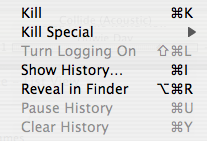
Note how I placed the kill menu items at the top, with logging, show history, reveal, and then pause/clear history next, in that order. While this, I admit, is much nitpicking, this ordering is all wrong.
First of all, the most destructive menu items, the kill menu items, are at the top. Minus a point. Second, the menu items related to the history windows are all over the place: the most important one, show history, is languishing in the middle. Minus another point. The pause and clear history items are separated from the show history item. Minus a point. Finally, logging, which necessarily has to come AFTER showing the history window, is placed first, before all other history menu items! Minus another point! Finally, revealing in Finder, as a consequence, is just lost somewhere in the middle, even though it's probably the most frequently used command and should be at the top. That's five UI baddies right in a menu of seven items.
Here's how I restructured it for the upcoming MUG release:
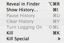
Note how all of the above problems have been resolved. Killing is at the bottom, since it's the most destructive action. Revealing is at the top, since it'll be the most frequently used item. Show history is next (since it'll probably be the next-most-frequently used), with pause, clear, and logging naturally following since they are all related to the history windows.
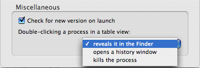
But this isn't the whole story. I didn't actually restructure the menu until I implemented two other features: contextual menus and double-click actions. In MUG 2.5.1, double-clicking on an item in the table views didn't do anything. I've long wanted to change that, and the next release will allow you to choose whether to reveal an item in the Finder, show its history window, or kill it when you double-click it. You'll also be able to initiate these actions from a contextual menu. But this necessitates two more menus: a contextual menu and a preference menu, shown here.
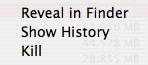
First, note how these two menus both show the three items in the exact same order. Next, note how they show them in the same order as the restructured Process menu -- revealing first, history second, killing last.
This is no accident. When I created the contextual menu, I ordered it like the old Process menu, with the kill menu item first. But I realized that the danger of accidentally hitting the kill menu option was much more prevalent in the contextual menu than it was in the Process menu, so it necessarily had to come last in the list. Then I realized that the prefs menu needed to be put in the same order, and then the Process menu itself had to be restructured, leading me to the conclusion that my Process menu was crappily organized.
Now I'm much more happy about it.
Interface Issue 3: Menu Item Names
There's something even more fundamental about menus, and that's the names of the menu items themselves. From the start, I've always been leery about using the word "Process" in MUG, because it can easily be confused with the action rather than the noun. But I decided to use it anyway, because "application" doesn't work when you're dealing with UNIX executables (especially in a Mac environment when only certain things are called applications). That's a more obvious example, but here's a less obvious one:
Have you ever noticed those little ellipses at the end of some menu items in applications? Well, that's supposed to mean that the menu item opens a new window or requires additional information before being able to perform that action. For example, the "Preferences..." menu item opens the prefs window, so it needs an ellipsis. Showing process history opens a new window, so you need an ellipsis in the "Show History..." menu item. Similarly, even commands that show sheets should probably have an ellipsis in their menu item.
But what if sometimes the menu item sometimes needs additional info, and sometimes it doesn't? In MUG, confirmations are displayed by default when you attempt to kill a process. In this case, an ellipsis would be needed. But you can turn those confirmations off, so when they're off, the ellipsis should be left off. What to do?
I think this was a change in MUG 2.5 or 2.5.1 (i.e.: I didn't do this since version 2.2), but MUG changes the name of the menu item depending on whether you choose to display confirmations or not. That is, if you turn off confirmations, the menu item will display as "Kill". If you leave them on, the menu item will display as "Kill...". This change is immediate: as soon as you change the preference, the name of the menu item changes.
Another instance of this is one of the Kill Special submenu items. There's an item to kill the Dock without explicitly finding it in the list of processes. However, in Tiger, this also kills Dashboard as well. So MUG automatically detects whether you have Tiger or not: if you do, this menu item will display as "Kill Dock/Dashboard", and if you have an earlier version of Mac OS X, it simply displays as "Kill Dock".
(You could argue that the authentication dialog that comes up that requests a password should necessitate the ellipsis all the time, but I'd argue that this doesn't count since it's a system-wide dialog, not an application-specific dialog.)
This just goes to show that if some information doesn't apply to a user, you should probably gray it out or hide it. And even the gray out vs. hide issue is an important one -- if the feature will never, EVER apply to a user (as in the case of Dashboard killing and versions of Mac OS X before Tiger) then it's OK to hide the menu item. But if it's possible that the user would be able to use the feature, then it should be grayed out to indicate that the feature is there and potentially applicable under the correct circumstances.
Interface Issue 4: Menu Item Keyboard Equivalents
Another thorny issue is how to use command key sequences -- the keyboard equivalents to the menu item -- effectively. In MUG, I decided to give almost every menu item that I added a keyboard equivalent, because I don't have an inordinate number of menu items, and I can assign key sequences pretty easily without resorting to too many modifier keys (option, shift, control). This might not be the case with regards to larger applications like Microsoft Office -- that program would have so many more menu items, and therefore would have to be a little more judicious as to where to use keyboard equivalents.
With the upcoming version of MUG, I previously noted that I had added a "Kill Special" submenu, that allows fast access to the killing of the Finder, the Dock/Dashboard, the right side of the menubar, and Classic. I expect these to be very frequently used menu options for my users, since you don't have to find these processes in the list before being able to kill them -- MUG automatically figures out which process to kill. As such, I knew that I would have to add keyboard equivalents for these four menu items. But what to choose?
With version 2.5.1, I had reached virtually the upper limit on assigning keyboard sequences to every menu item, and I realized that I would have to start being more frugal with their use. But regardless, these four menu items needed keyboard equivalents.
I ended up assigning them Command-1, Command-2, Command-3, and Command-4. This was a fairly logical decision, because they are all similar menu items and therefore should have similar keyboard sequences. Assigning different letters would not be a case of similar keyboard sequences, so the numbers worked well. Unfortunately, I had already assigned these keyboard sequences to the toggling of various columns in the Tab/List View windows.
In the end, though, I changed them anyway -- my users are going to be much more likely to want to kill those special processes than they are to be toggling the visibility of different columns. I know that, personally, I choose a set of columns I want visible and rarely change that afterwards. So it's more like a one-time preference rather than something that you do all the time. Because of this, I'd rather alienate the few users who use these sequences to reveal various columns in order to please the others who will be more likely to make use of these new keyboard sequences.
(Moral: choose your keyboard sequences carefully, because once they're set, you really risk putting a bitter taste in the mouth of your users when you change them later on. But that doesn't mean you should ignore good usability in favor of entrenched habit.)
Interface Issue 5: Preference Consistency
It's vitally important to keep your interface synchronized throughout the whole application, and here's a great example of that. Again, I refer you to the confirmation sheets that slide out when you try to kill a process, and the fact that these sheets can be turned off. When I first introduced this feature, I also introduced a convenience preference to allow you to turn off these sheets right from the sheet -- there's always a "Never show this alert again" checkbox whenever the confirmations come up.
This preference is also exposed in the preferences dialog, though. So what happens when you check the box on the sheet, and then go into the preferences. How should the box in the prefs dialog be shown right after you change it right on the sheet? Should it update after you dismiss the sheet?
In MUG, I implemented the change to be effective immediately, and the interface automatically synchronizes as soon as you toggle the preference. That means that if you have the preferences window open and a confirmation sheet open, and you toggle the preference on one of those dialogs, the interface automatically changes in the other. That way there will never be any ambiguity as to whether a confirmation will come up or not.
This feature also works across multiple confirmation dialogs. Since you can have multiple confirmation dialogs up at once, if you toggle the pref in one dialog, the other dialogs automatically update their interface to reflect the change. Unless there's a bug, it should be impossible to get the checkboxes to be out of sync. Check out this movie to see this in action (QT6 required, 1 MB in size).
Apple Bug Friday XX: iChat Audio/Video Chat Icons
In the vein of intuitivity, I'd like to file a bug on iChat, and a particular problem that bugged me in iChat 3.0 in Tiger. If you've ever used iChat AV on Jaguar, Panther, or Tiger, you may have realized that you can sometimes initiate a one-way audio or video chat with another user. That is, that person doesn't have the hardware necessary to transmit their audio or video, but they DO have the ability to view YOUR audio and video. So they can hear and/or see you, and they respond with text. It's a nice little feature so that those iSights aren't as useless as they appear to be.
However, with Tiger, Apple appeared to remove this feature. There used to be separate menu items for one-way audio chats and one-way video chats, but Apple removed them with iChat 3.0, so it appeared that this feature was removed. But, in fact, it wasn't -- you just use the normal audio and video chat menu items, and you can even initiate one-way chats via the little green icons that appear next to buddies!
This is kind of annoying, though, in that you can't immediately tell whether you're going to initiate a two-way video chat or a one-way video chat before it starts. So this is a small interface bug: there needs to be separate green icons for one-way audio and video chats, and the menu item for audio and video chats needs to change to explicitly say "one-way" depending on which buddy you select. Filed: 4374998. [UPDATE: Apparently, this is not a bug.]
Conclusion
Designing a great interface is hard and time-consuming. If you want to design a great interface, you have to be a perfectionist. If you're a perfectionist, it will take a long time to design a great interface.
Hope you enjoyed this long rant.
Last night I was doing some more programming on Memory Usage Getter, and I thought that it might be instructive (to perhaps a few people, at least) to illustrate what kinds of things I think about when making additions to Memory Usage Getter. Since this is my weblog, I don't have any qualms about posting bunches of screenshots of Memory Usage Getter, but this isn't meant to be an advertisement for my "flagship" program. Rather, I'm interested in the details of a program, and hopefully others are too. I don't care if any registrations come from this post, but if only one or two people find it mildly interesting, then this post has done it's job.
History
First, a little history: if you've never used Memory Usage Getter, it's sort of a clone of the Process Viewer/Activity Monitor programs that come with Mac OS X. Memory Usage Getter was conceived when Mac OS X was still at version 10.1 (did Process Viewer even exist in 10.1?). Basically, MUG 1.0 was purely an AppleScript applet, and as such, it wasn't extremely useful. (MUG 1.0 was actually based on a hint posted on MacOSXHints.com, the author of which still lives in the credits of MUG, albeit it anonymous form, just like the hint.) However, AppleScript applets are limited to displaying info in a series of dialogs, which wasn't pretty at all.
(You can actually still download version 1.0.1 of MUG -- as well as all other publicly released versions -- over at VersionTracker. So feel free to follow along in the history by looking at the different versions, but I make no guarantee as to whether they will work in the latest versions of Mac OS X, even though they should.)
MUG 2.0 (which I later decided was version number creep, but maybe it wasn't after all, since it WAS a substantial upgrade) was built in AppleScript Studio. This was much better -- it allowed for a genuine interface with progress bars (to show memory usage), and allowed for the display of memory usage and application names in an easier-to-understand interface. Version 2.0 was also the first to sport the Tab View of MUG.
It quickly became clear that as of version 2.0.2 of MUG, MUG was pushing the limits of even AppleScript Studio. MUG took a few seconds to refresh and display the newest memory usage statistics, and using XML preference files and handling all the variables and stuff for display was getting pretty nasty. Speed was the main factor, as I got a bunch of support e-mails saying that it always took too long to refresh. So I decided to bite the bullet and learn Objective-C for MUG. (Note that I had had no formal programming experience by this time -- and I learned Objective-C directly from Aaron Hilleglass' excellent book, rather than learning C first.) MUG 2.1 was the result.
MUG 2.1 to MUG 2.5.1 was a gradual evolution of the program to include new features and preferences and bug fixes. Version 2.2 added a true Cocoa toolbar, as well as the ability to kill processes from within MUG (which was an enormous feat for me, because it required using Authentication Services -- this API doesn't have a Cocoa exposure, so I needed to learn a bit of Carbon programming to accomplish this). Version 2.2.1 added Dock icon reporting, and version 2.5 added logging and process history. So at this point it's safe to say that MUG is a fairly mature product, at least from my point of view.
Already you can see an evolution in terms of increasing usability. Crappy user interface (series of dialogs in AppleScript), to a semi-crappy interface (series of text fields and progress bars in a window) to a fairly good interface (Cocoa table view) to a good interface (Cocoa toolbar), to what I think is an awesome interface (updated icons in 2.5 ;) ). But there are some more minor things I'd like to highlight.
Interface Issue I: Unnecessary interaction
After the release of 2.2 which added the ability to kill processes from inside MUG, I gradually started to encounter a few cases where this feature wouldn't work. In MUG, killing a process used the "kill" command-line utility to terminate a program. But, as it turns out, some programs can ignore these messages, and so this kill feature didn't always work. It was quite annoying, too -- you'd kill it, refresh, and see that it's still sitting there. This deficiency in my own program led me to neglect this feature in MUG and instead use the Terminal, because in later versions of Mac OS X, more programs started ignoring these kill messages.
I actually haven't received a single e-mail about this problem ever since the feature was introduced (to my knowledge), but I was aware of the problem almost right from the release of MUG 2.2. I planned on introducing "force kill" in a future version of MUG that would allow the user to force a process to terminate -- MUG would send a "kill -9" message (via the command line) to the program, which is an uninterruptable, unignorable message to terminate. No program can resist a "kill -9" message.
If you ever delved into the package contents of earlier versions of MUG, you'd have seen that there were already dialogs for force killing, and I'd even programmed the ability to do force kills through Authentication Services. I just never got around to exposing the feature to the user interface, for reasons unknown. I guess I never found it a priority, because I always used the Terminal, and no one else really seemed to care. It was always at the back of my mind, but other features always took precedent.
If you look at other utilities, typically what happens is they first attempt to send a simple "kill" message to the process you want to terminate. If the process doesn't terminate and you request that utility to terminate the same process again, the utility senses that it just tried to kill the process, and now sends a "kill -9" message instead. I believe that the Dock follows this paradigm -- I've had numerous instances where the first force quit via the Dock (hold down option when showing the Dock menu to reveal the Force Quit option) doesn't work, but the second one always does. It's just a succession of "kill" followed by "kill -9".
Last night, though, in programming MUG, I realized something -- why do other utilities force the user to request the kill twice before the process terminates? If a user is trying to a kill a process, they obviously have no qualms about doing so, regardless of the consequences and whether data will be lost and such. If they did, they'd try to quit the program using the quit menu item. So if the user is trying to kill the program, why do they request the task to be done twice?
So I implemented my force kill differently -- if you request a MUG to kill a process, it first sends a "kill" message. Then, it automatically refreshes the internal list of active processes, checks to see if the process is still running, and if it is, then it automatically sends a "kill -9" message to the same process. In my experience, this seems to work perfectly. (I can actually reliably test this feature by using Snapz Pro X as a case study -- it is NOTORIOUS for ignoring "kill" messages, for some reason.)
This is a prime example of a waste of human effort: there's no ambiguity as to what the user wants to do, and therefore the program should do it, no matter what other processes have to say.
Interface Issue 2: Menu Structure
The structure of menus in a program is also something that needs to really be considered when programming a user interface. It needs to be well laid out, it needs to be easy to find what you want to do, but it shouldn't be littered with tons of unnecessary items and options. For example, previous versions of MUG before 2.5 had placed items like "Kill" in the File menu, which didn't really make sense. For that reason, when I introduced logging, process history, and revealing, I created a new Process menu for all those actions that act on a specific process. The File menu is now reserved for general options, like refreshing, turning on general logging, turning on auto-refresh, and authenticating without any other specific action.
You might say that the name of this menu -- the File menu -- is not appropriate for MUG. That's true: none of the menu items in the File menu really have to do anything with files. However, in this case, I believe that consistency wins out, because if the program didn't have a file menu, users would be a bit more bewildered as to where to go to find things. For better or for worse, the File menu has always been (even in the Classic Mac OS days) kind of a catch-all menu for those menu items that don't really go anywhere else, and this has become user expectation. (A great example of this would be the Quit menu item in the Classic Mac OS -- what does quitting have to do with a file? And Mac OS X remedies this by creating the application menu.)
Menu structure doesn't have to deal with just the menu bar at the top of the screen, though. Take, for example, the Process menu in MUG. As of version 2.5.1 (well, actually a bit later than 2.5.1, since I added the Kill Special submenu here), this is what the Process menu looks like:
Note how I placed the kill menu items at the top, with logging, show history, reveal, and then pause/clear history next, in that order. While this, I admit, is much nitpicking, this ordering is all wrong.
First of all, the most destructive menu items, the kill menu items, are at the top. Minus a point. Second, the menu items related to the history windows are all over the place: the most important one, show history, is languishing in the middle. Minus another point. The pause and clear history items are separated from the show history item. Minus a point. Finally, logging, which necessarily has to come AFTER showing the history window, is placed first, before all other history menu items! Minus another point! Finally, revealing in Finder, as a consequence, is just lost somewhere in the middle, even though it's probably the most frequently used command and should be at the top. That's five UI baddies right in a menu of seven items.
Here's how I restructured it for the upcoming MUG release:
Note how all of the above problems have been resolved. Killing is at the bottom, since it's the most destructive action. Revealing is at the top, since it'll be the most frequently used item. Show history is next (since it'll probably be the next-most-frequently used), with pause, clear, and logging naturally following since they are all related to the history windows.
But this isn't the whole story. I didn't actually restructure the menu until I implemented two other features: contextual menus and double-click actions. In MUG 2.5.1, double-clicking on an item in the table views didn't do anything. I've long wanted to change that, and the next release will allow you to choose whether to reveal an item in the Finder, show its history window, or kill it when you double-click it. You'll also be able to initiate these actions from a contextual menu. But this necessitates two more menus: a contextual menu and a preference menu, shown here.
First, note how these two menus both show the three items in the exact same order. Next, note how they show them in the same order as the restructured Process menu -- revealing first, history second, killing last.
This is no accident. When I created the contextual menu, I ordered it like the old Process menu, with the kill menu item first. But I realized that the danger of accidentally hitting the kill menu option was much more prevalent in the contextual menu than it was in the Process menu, so it necessarily had to come last in the list. Then I realized that the prefs menu needed to be put in the same order, and then the Process menu itself had to be restructured, leading me to the conclusion that my Process menu was crappily organized.
Now I'm much more happy about it.
Interface Issue 3: Menu Item Names
There's something even more fundamental about menus, and that's the names of the menu items themselves. From the start, I've always been leery about using the word "Process" in MUG, because it can easily be confused with the action rather than the noun. But I decided to use it anyway, because "application" doesn't work when you're dealing with UNIX executables (especially in a Mac environment when only certain things are called applications). That's a more obvious example, but here's a less obvious one:
Have you ever noticed those little ellipses at the end of some menu items in applications? Well, that's supposed to mean that the menu item opens a new window or requires additional information before being able to perform that action. For example, the "Preferences..." menu item opens the prefs window, so it needs an ellipsis. Showing process history opens a new window, so you need an ellipsis in the "Show History..." menu item. Similarly, even commands that show sheets should probably have an ellipsis in their menu item.
But what if sometimes the menu item sometimes needs additional info, and sometimes it doesn't? In MUG, confirmations are displayed by default when you attempt to kill a process. In this case, an ellipsis would be needed. But you can turn those confirmations off, so when they're off, the ellipsis should be left off. What to do?
I think this was a change in MUG 2.5 or 2.5.1 (i.e.: I didn't do this since version 2.2), but MUG changes the name of the menu item depending on whether you choose to display confirmations or not. That is, if you turn off confirmations, the menu item will display as "Kill". If you leave them on, the menu item will display as "Kill...". This change is immediate: as soon as you change the preference, the name of the menu item changes.
Another instance of this is one of the Kill Special submenu items. There's an item to kill the Dock without explicitly finding it in the list of processes. However, in Tiger, this also kills Dashboard as well. So MUG automatically detects whether you have Tiger or not: if you do, this menu item will display as "Kill Dock/Dashboard", and if you have an earlier version of Mac OS X, it simply displays as "Kill Dock".
(You could argue that the authentication dialog that comes up that requests a password should necessitate the ellipsis all the time, but I'd argue that this doesn't count since it's a system-wide dialog, not an application-specific dialog.)
This just goes to show that if some information doesn't apply to a user, you should probably gray it out or hide it. And even the gray out vs. hide issue is an important one -- if the feature will never, EVER apply to a user (as in the case of Dashboard killing and versions of Mac OS X before Tiger) then it's OK to hide the menu item. But if it's possible that the user would be able to use the feature, then it should be grayed out to indicate that the feature is there and potentially applicable under the correct circumstances.
Interface Issue 4: Menu Item Keyboard Equivalents
Another thorny issue is how to use command key sequences -- the keyboard equivalents to the menu item -- effectively. In MUG, I decided to give almost every menu item that I added a keyboard equivalent, because I don't have an inordinate number of menu items, and I can assign key sequences pretty easily without resorting to too many modifier keys (option, shift, control). This might not be the case with regards to larger applications like Microsoft Office -- that program would have so many more menu items, and therefore would have to be a little more judicious as to where to use keyboard equivalents.
With the upcoming version of MUG, I previously noted that I had added a "Kill Special" submenu, that allows fast access to the killing of the Finder, the Dock/Dashboard, the right side of the menubar, and Classic. I expect these to be very frequently used menu options for my users, since you don't have to find these processes in the list before being able to kill them -- MUG automatically figures out which process to kill. As such, I knew that I would have to add keyboard equivalents for these four menu items. But what to choose?
With version 2.5.1, I had reached virtually the upper limit on assigning keyboard sequences to every menu item, and I realized that I would have to start being more frugal with their use. But regardless, these four menu items needed keyboard equivalents.
I ended up assigning them Command-1, Command-2, Command-3, and Command-4. This was a fairly logical decision, because they are all similar menu items and therefore should have similar keyboard sequences. Assigning different letters would not be a case of similar keyboard sequences, so the numbers worked well. Unfortunately, I had already assigned these keyboard sequences to the toggling of various columns in the Tab/List View windows.
In the end, though, I changed them anyway -- my users are going to be much more likely to want to kill those special processes than they are to be toggling the visibility of different columns. I know that, personally, I choose a set of columns I want visible and rarely change that afterwards. So it's more like a one-time preference rather than something that you do all the time. Because of this, I'd rather alienate the few users who use these sequences to reveal various columns in order to please the others who will be more likely to make use of these new keyboard sequences.
(Moral: choose your keyboard sequences carefully, because once they're set, you really risk putting a bitter taste in the mouth of your users when you change them later on. But that doesn't mean you should ignore good usability in favor of entrenched habit.)
Interface Issue 5: Preference Consistency
It's vitally important to keep your interface synchronized throughout the whole application, and here's a great example of that. Again, I refer you to the confirmation sheets that slide out when you try to kill a process, and the fact that these sheets can be turned off. When I first introduced this feature, I also introduced a convenience preference to allow you to turn off these sheets right from the sheet -- there's always a "Never show this alert again" checkbox whenever the confirmations come up.
This preference is also exposed in the preferences dialog, though. So what happens when you check the box on the sheet, and then go into the preferences. How should the box in the prefs dialog be shown right after you change it right on the sheet? Should it update after you dismiss the sheet?
In MUG, I implemented the change to be effective immediately, and the interface automatically synchronizes as soon as you toggle the preference. That means that if you have the preferences window open and a confirmation sheet open, and you toggle the preference on one of those dialogs, the interface automatically changes in the other. That way there will never be any ambiguity as to whether a confirmation will come up or not.
This feature also works across multiple confirmation dialogs. Since you can have multiple confirmation dialogs up at once, if you toggle the pref in one dialog, the other dialogs automatically update their interface to reflect the change. Unless there's a bug, it should be impossible to get the checkboxes to be out of sync. Check out this movie to see this in action (QT6 required, 1 MB in size).
Apple Bug Friday XX: iChat Audio/Video Chat Icons
In the vein of intuitivity, I'd like to file a bug on iChat, and a particular problem that bugged me in iChat 3.0 in Tiger. If you've ever used iChat AV on Jaguar, Panther, or Tiger, you may have realized that you can sometimes initiate a one-way audio or video chat with another user. That is, that person doesn't have the hardware necessary to transmit their audio or video, but they DO have the ability to view YOUR audio and video. So they can hear and/or see you, and they respond with text. It's a nice little feature so that those iSights aren't as useless as they appear to be.
However, with Tiger, Apple appeared to remove this feature. There used to be separate menu items for one-way audio chats and one-way video chats, but Apple removed them with iChat 3.0, so it appeared that this feature was removed. But, in fact, it wasn't -- you just use the normal audio and video chat menu items, and you can even initiate one-way chats via the little green icons that appear next to buddies!
This is kind of annoying, though, in that you can't immediately tell whether you're going to initiate a two-way video chat or a one-way video chat before it starts. So this is a small interface bug: there needs to be separate green icons for one-way audio and video chats, and the menu item for audio and video chats needs to change to explicitly say "one-way" depending on which buddy you select. Filed: 4374998. [UPDATE: Apparently, this is not a bug.]
Conclusion
Designing a great interface is hard and time-consuming. If you want to design a great interface, you have to be a perfectionist. If you're a perfectionist, it will take a long time to design a great interface.
Hope you enjoyed this long rant.
Technological Supernova Apple Bug Friday Older Newer Post a Comment